Comparing obesity rates across US states.
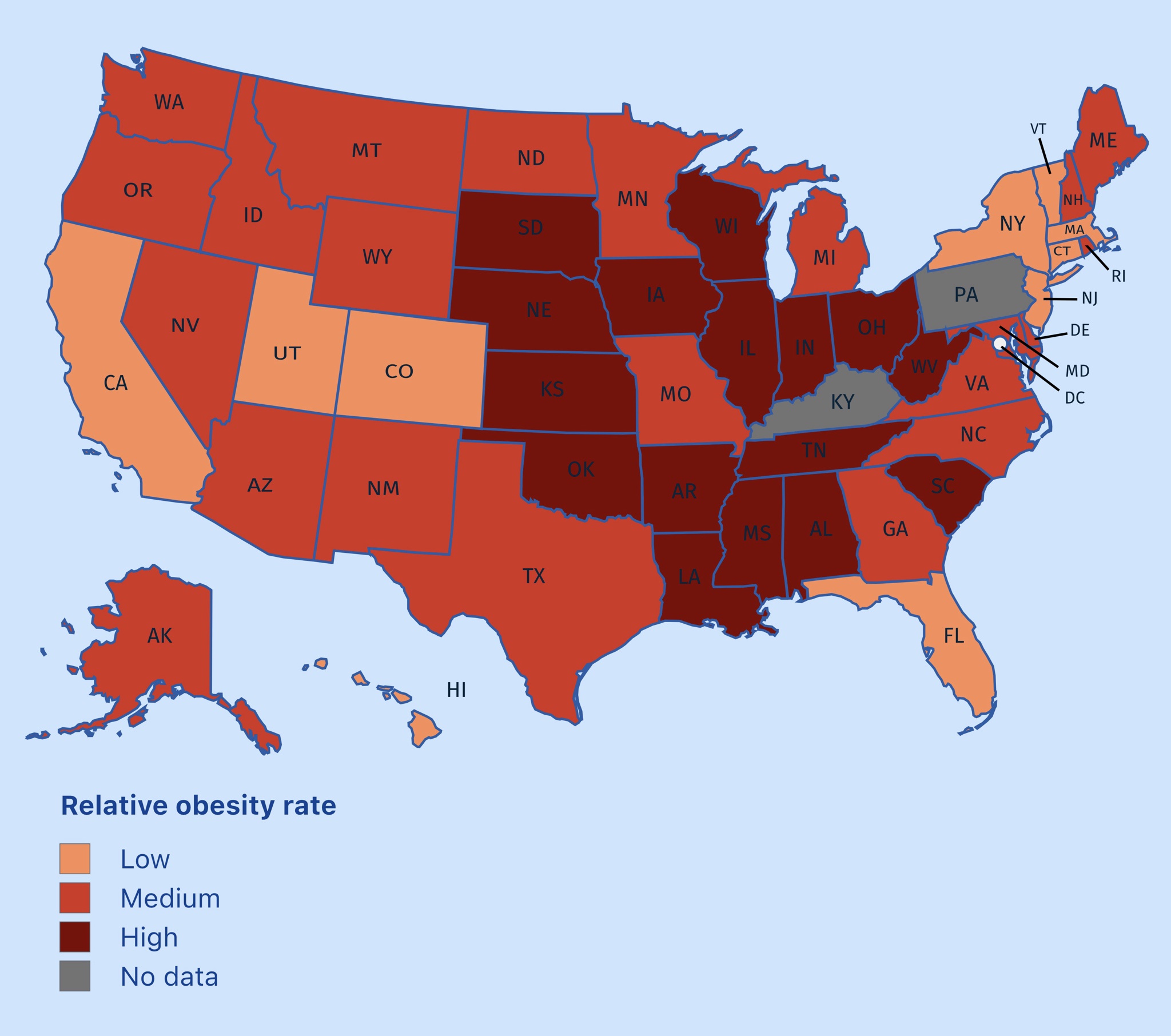
A color-coded map of the United States showing relative obesity rates, with states shaded in orange, red, or dark red to indicate low, medium, or high rates respectively, and a few states in gray indicating no data. The map includes all 50 states labeled with their two-letter postal abbreviations and a legend in the bottom left corner. A white dot with black lines points to a specific location in the northeastern region, near the border of Maryland and Delaware.
0
0
0
0
2025-03-04 14:26:31
See More Related Memes
Loading...
Comments
No comments yet. Be the first to comment!