A Friendly Reminder for Everyone
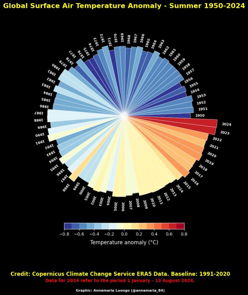
A circular chart displays global surface air temperature anomalies for summer from 1950 to 2024, with each year represented as a radial segment. Colors range from dark blue (cool) to red (warm), showing a clear trend toward warmer temperatures in recent years, especially 2024. A color bar at the bottom indicates temperature anomaly in degrees Celsius, with 2024's segment being the warmest red. The chart credits Copernicus Climate Change Service ERA5 Data and notes the 1991-2020 baseline period.
0
0
0
0
2025-07-04 02:30:02
See More Related Memes

Loading...
Comments
No comments yet. Be the first to comment!