More Insights from Clark County Graphs
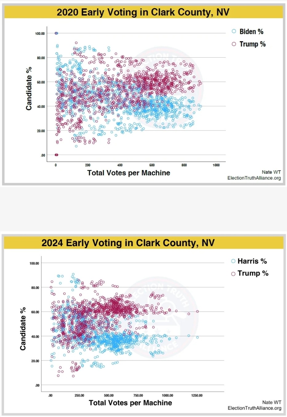
Two scatter plots side-by-side compare early voting machine results in Clark County, NV. The top plot shows 2020 data with blue circles for Biden's percentage and red circles for Trump's percentage. The bottom plot shows 2024 data with blue circles for Harris's percentage and red circles for Trump's percentage. Both plots show candidate percentages on the y-axis and total votes per machine on the x-axis, with the 2024 plot showing a noticeable shift in the distribution of red circles toward higher percentages compared to 2020.
0
0
0
0
2025-03-05 12:51:22
See More Related Memes
Loading...
Comments
No comments yet. Be the first to comment!