Create a Meme Here
Upload
Meme Generator

Understanding the Home Price to Income Ratio
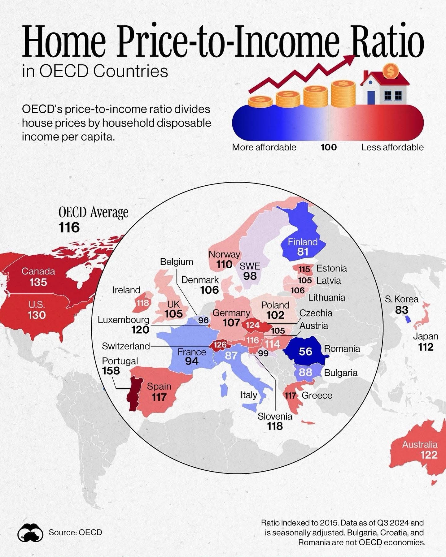
An infographic map showing the home price-to-income ratio for various OECD countries, color-coded from blue (more affordable) to red (less affordable), with each country labeled by its ratio number. The OECD average is 116, and countries like Canada (135) and the U.S. (130) are in red, while Romania (56) is in blue. The chart includes a legend explaining the ratio and a note that data is indexed to 2015 and from Q3 2024.

Report this content

An infographic map showing the home price-to-income ratio for various OECD countries, color-coded from blue (more…
Understanding the Home Price to Income Ratio

Create a Meme From This

0 0
0
2025-02-28 05:44:52

Share this meme

Comments

No comments yet. Be the first to comment!

See More Related Memes

Loading...
0
0
0
0