The Power of Nuclear Energy!
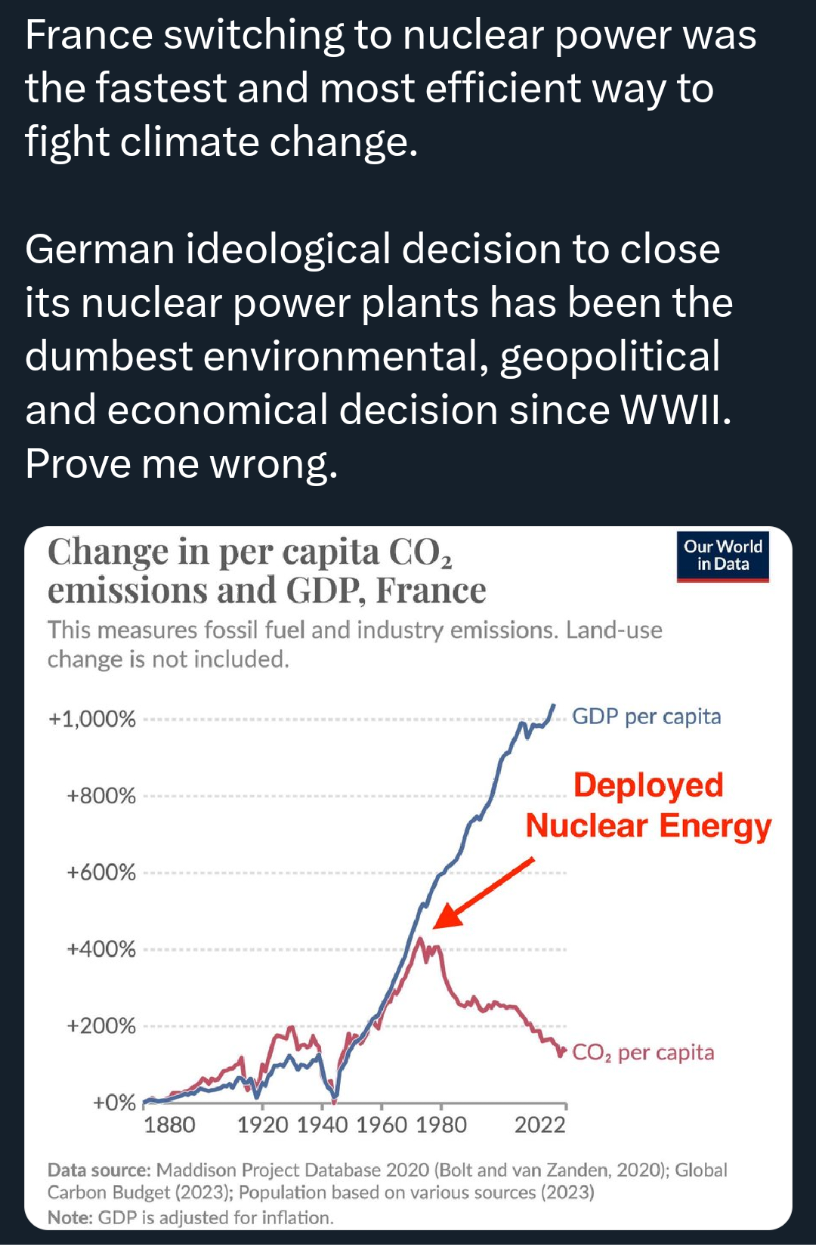
A graph from Our World in Data shows France's per capita CO2 emissions and GDP per capita from 1880 to 2022. The blue line (GDP per capita) rises sharply after 1960, while the red line (CO2 per capita) dips sharply around the same time, marked by a red arrow labeled 'Deployed Nuclear Energy'. Overlaid text claims France's nuclear switch was the best climate solution and Germany's nuclear phase-out was the worst decision since WWII.
0
0
0
0
2025-04-22 01:40:06
See More Related Memes
Loading...
Comments
No comments yet. Be the first to comment!