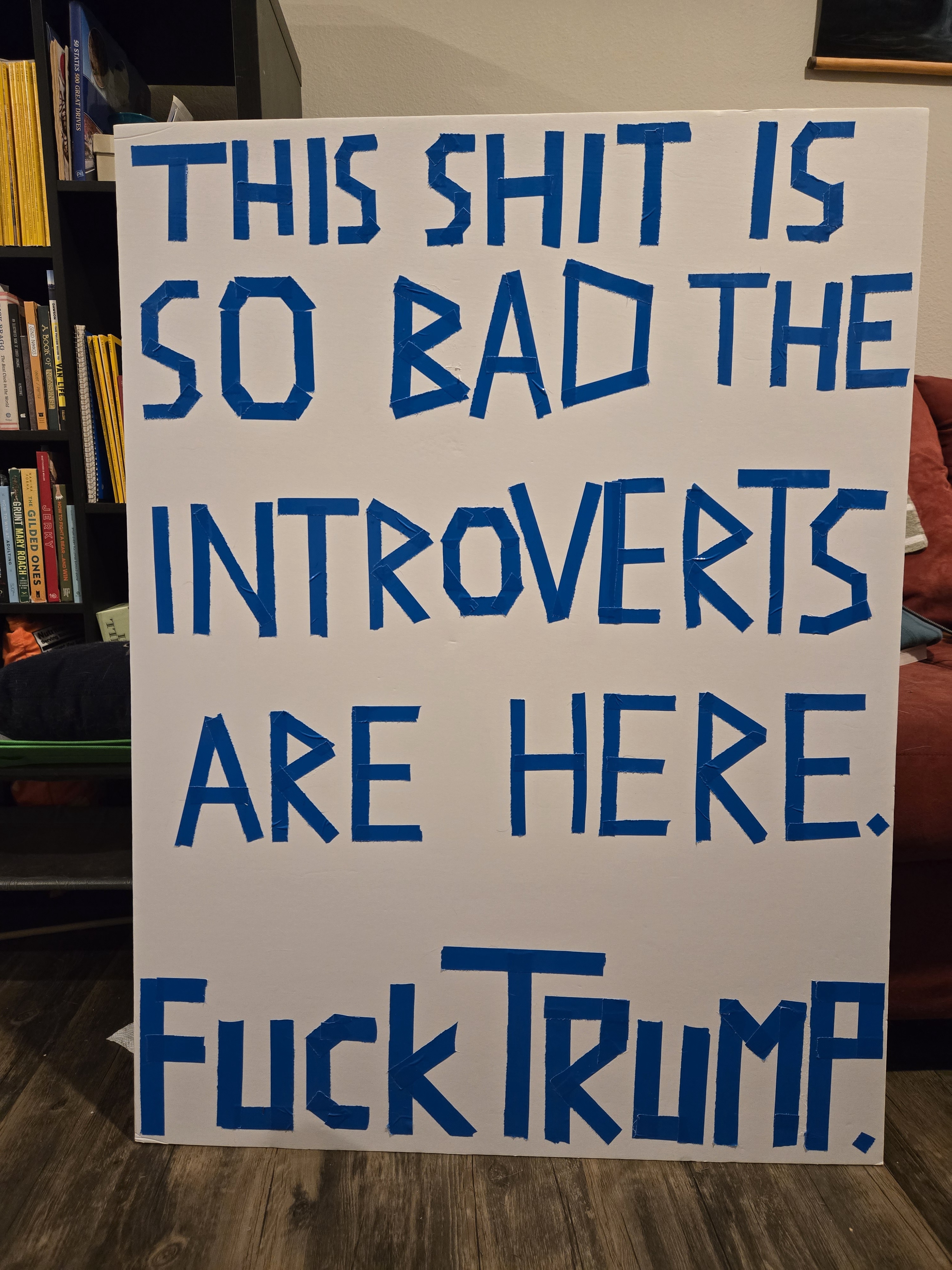
Hey Americans, Are You Doing Okay Out There?
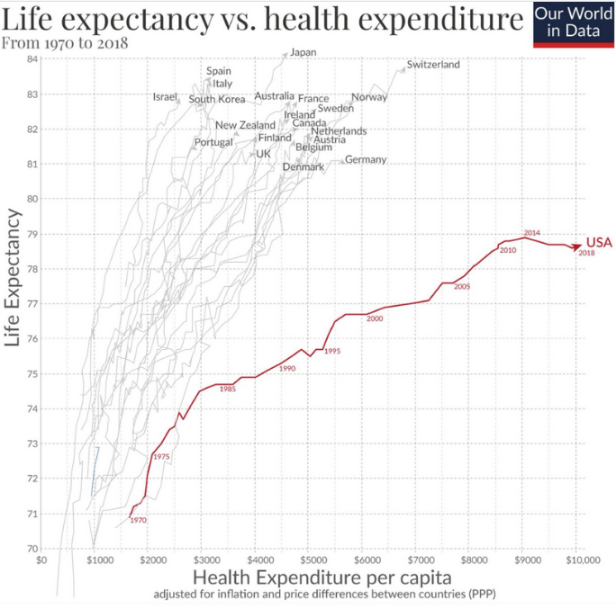
A line graph titled 'Life expectancy vs. health expenditure From 1970 to 2018' by Our World in Data, plotting life expectancy on the y-axis against health expenditure per capita (PPP) on the x-axis. Numerous countries are labeled along their respective lines, with the USA's line highlighted in red and ending at 'USA 2018' near the top right, showing a slight dip from its 2014 peak. The graph visually contrasts the USA's high spending with its relatively lower life expectancy compared to many other nations.
0
0
0
0
2025-03-04 03:48:25
See More Related Memes

Loading...
Comments
No comments yet. Be the first to comment!