Let's strive for a better America together.
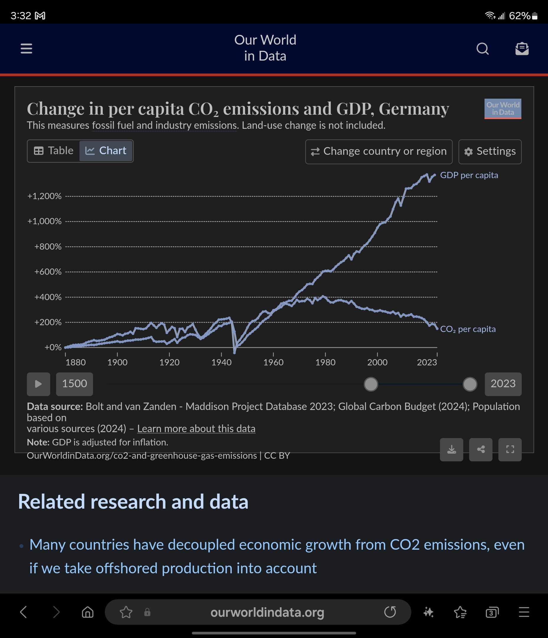
A screenshot of a line chart from 'Our World in Data' showing Germany's per capita CO2 emissions and GDP per capita from 1880 to 2023. The chart displays two lines: one for GDP per capita (rising sharply) and one for CO2 per capita (peaking around 1970 and then declining). The overlaid text 'GDP per capita' labels the upper line, while the lower line is labeled 'CO2 per capita'.
0
0
0
0
2025-04-21 01:50:04
See More Related Memes

Loading...
Comments
No comments yet. Be the first to comment!