The Surprising Truth Behind Polio Vaccine Data
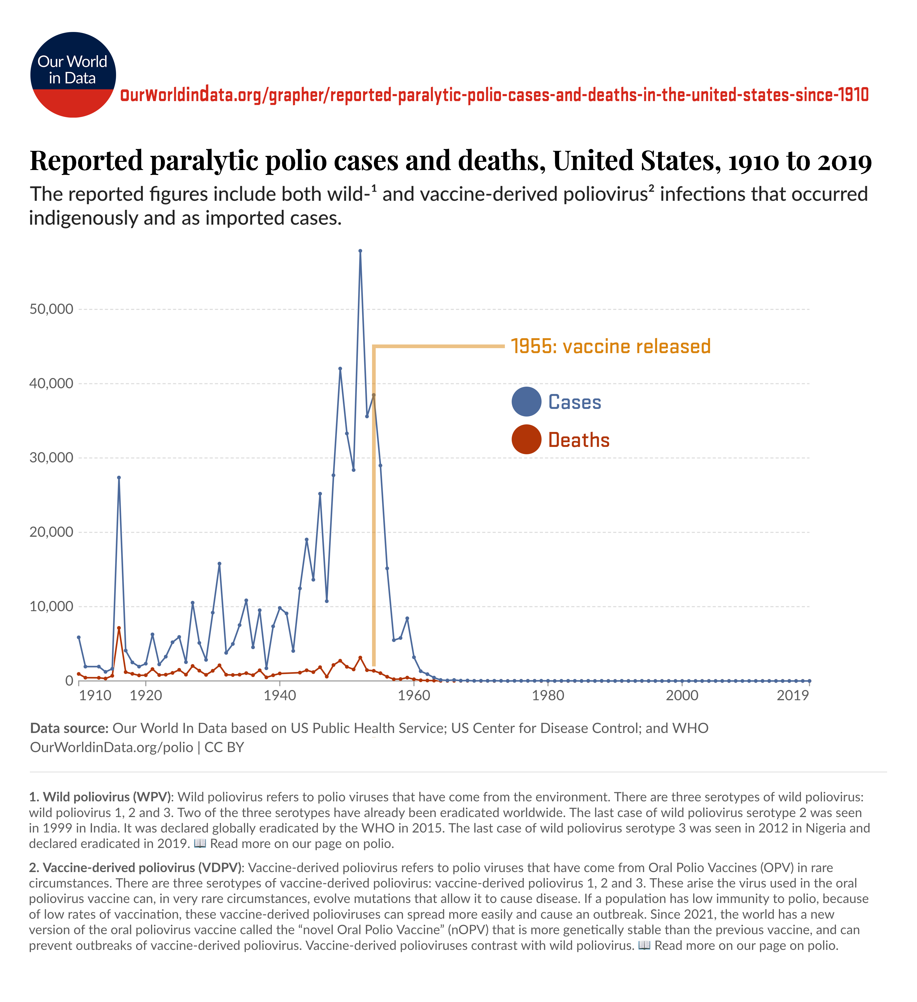
A line graph from Our World in Data shows reported paralytic polio cases and deaths in the United States from 1910 to 2019. The blue line represents cases and the red line represents deaths, both showing a dramatic decline after a vertical orange line labeled '1955: vaccine released'.
0
0
0
0
2025-04-17 02:00:05
See More Related Memes

Loading...
Comments
No comments yet. Be the first to comment!