Understanding Data: The Neutral Perspective
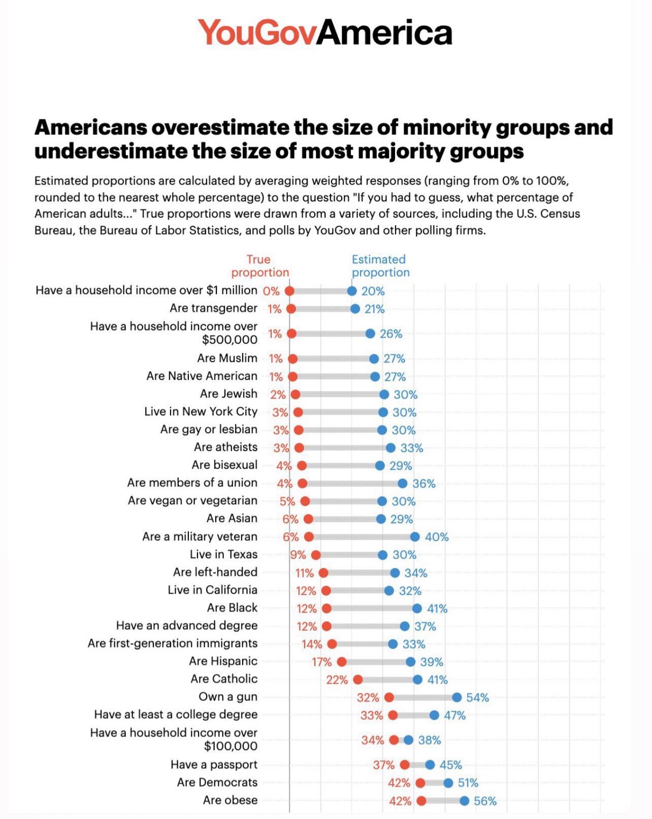
A YouGovAmerica bar chart compares 'True proportion' (red dots) with 'Estimated proportion' (blue dots) for various demographic traits among American adults. The chart shows that for traits like being Black (12% true, 41% estimated) or Catholic (22% true, 41% estimated), people significantly overestimate their prevalence. Conversely, for traits like having a household income over $1 million (0% true, 20% estimated) or being transgender (1% true, 21% estimated), people also overestimate, but the chart's title implies this is a general pattern of misestimation. The chart's title states Americans overestimate minority groups and underestimate majority groups, but the data shows overestimation for both categories.
0
0
0
0
2025-03-03 22:44:21
See More Related Memes

Loading...
Comments
No comments yet. Be the first to comment!