I've never experienced a time when the general sentiment on the street was 'Things are getting better,' but in many ways, they truly are.
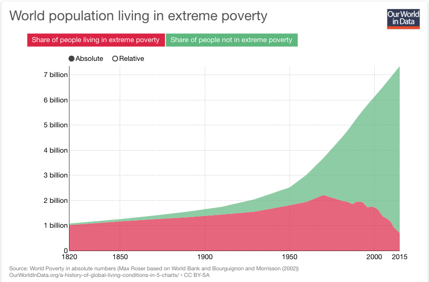
A line graph from Our World in Data shows the world population living in extreme poverty (red area) and not in extreme poverty (green area) from 1820 to 2015. The red area, representing absolute poverty, starts high and declines sharply after 1950, while the green area, representing those not in poverty, grows steadily and dominates the chart by 2015. The chart's title is 'World population living in extreme poverty' and includes a legend for absolute vs. relative measures.
0
0
0
0
2025-03-04 02:02:42
See More Related Memes

Loading...
Comments
No comments yet. Be the first to comment!