Comparing Health Systems: A Comprehensive Overview
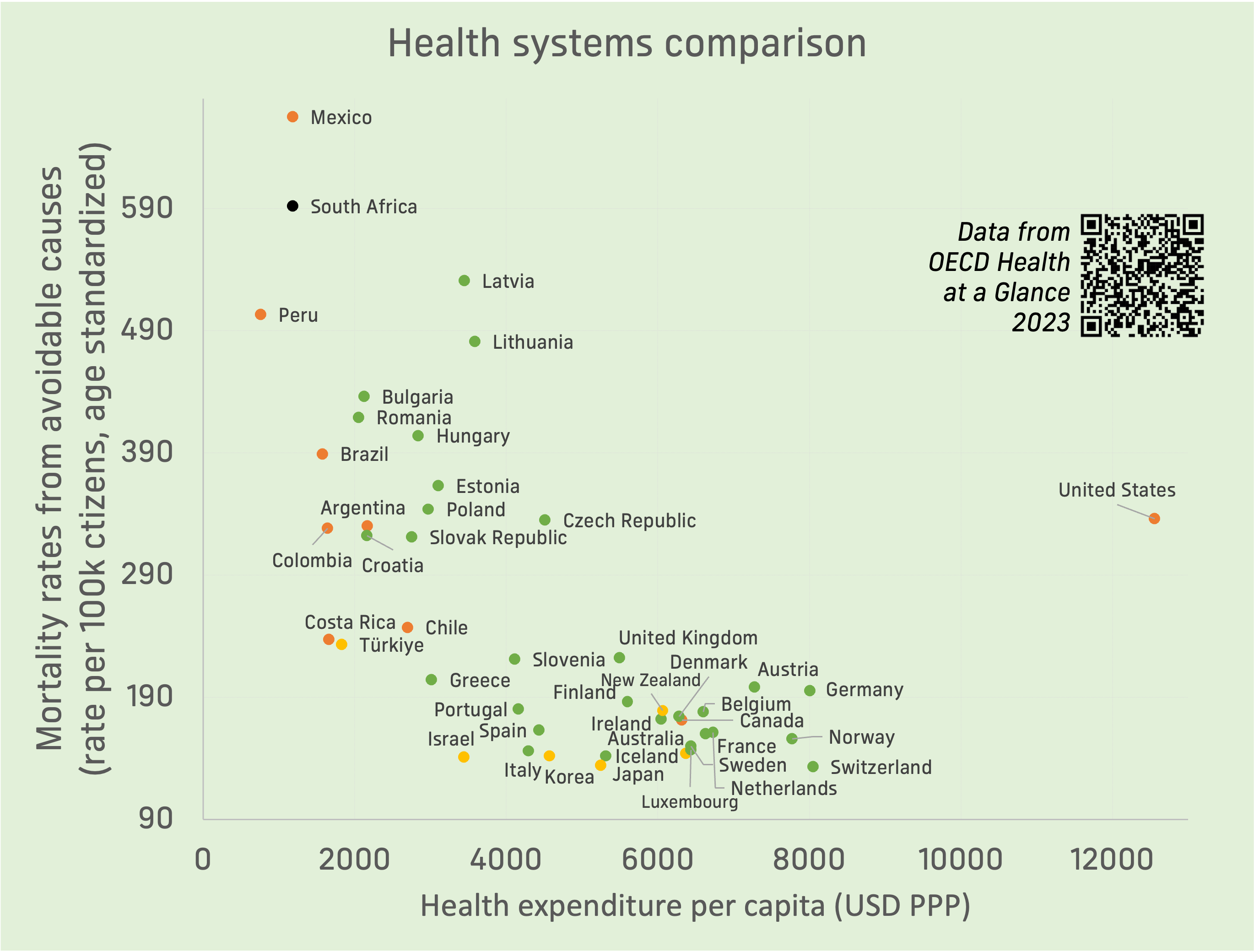
A scatter plot titled 'Health systems comparison' shows countries plotted by health expenditure per capita (x-axis) versus mortality rates from avoidable causes (y-axis). The United States is positioned far right with high expenditure and high mortality, while many other wealthy nations cluster lower on the mortality axis. Data source is cited as 'OECD Health at a Glance 2023'.
0
0
0
0
2025-04-20 13:50:06
See More Related Memes

Loading...
Comments
No comments yet. Be the first to comment!